CityPups Case Study
Project Overview
The product:
CityPups is a mobile app that helps people living in cities find the perfect dogs to adopt.
Project duration:
August 2023
The problem:
Because of their unique city-living needs, people in major metropolitan areas often struggle to find dogs to adopt that are well suited for such environments. So, the CityPups app was created to help people in cities match with the perfect dogs for their needs. However, in our initial usability study of the app, we determined that users didn't feel that the app collected enough specific information to help them feel confident that the dogs they were matched with would be the best fits for their situations. Not solving for this problem could result in abandonment of the adoption process.
The goal:
Improve the onboarding process to provide users with more specific information that will help them better determine if a dog match fits their space and lifestyle
My role:
UX Designer
Analyzing research
Wireframing
Prototyping
User research: Summary
I observed the research participant walk through the onboarding experience and documented key findings. I took notes from the interview and broke them into 3 categories to help me synthesize my research notes. My categories are what went well, what needed improvement, and other notes and quotes from the interview.
Points of friction
I was able to identify three points of friction in three screens of the onboarding process.
What went well?
Easy to understand prompts
Exactly what the research participant was expecting to see from this screen
What needed improvement?
Research participant was unsure about dog size specifics
Research participant expected to be able to select multiple options for dog size
Other notes and quotes
“I would like to know in pounds exactly how big medium and large dogs would be.”
“If I could, I would select tiny, small, and medium.”
What went well?
Workable navigation with clear instruction
What needed improvement?
Research participant pointed out that living space screen lacks options for alternative areas for dogs (parks, trails, backyards etc.)
Other notes and quotes
“I have access to a range of walking spaces, so I’m not really sure if I would select small based on those aspects of my living situation.”
What went well?
Research participant loved the continuity of the dog illustration
What needed improvement?
Needed more options for how often and/or how long a person can walk their dog
Sliding scale too vague. Research participant unsure how to quantify “not much” and “All the time”.
Other notes and quotes
“I guess it would be more helpful to know how many times a day I would be walking the dog or for how long.”
Sketches
Ideas to improve the CityPups experience
Rapid sketches
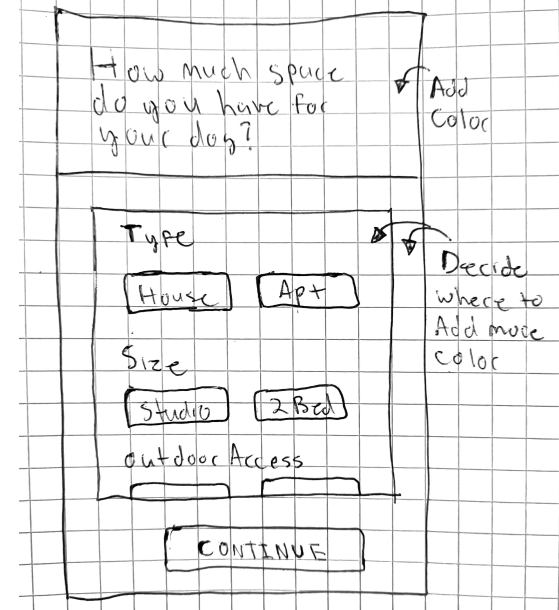
I sketched several new versions of the onboarding screens to show different ways to improve some of the issues observed in the usability test.
Detailed sketches
Next, I sketched more detailed version of the designs I chose from my rapid sketches.
1. Added more options to each screen. A user can select multiple options to better describe their space, ideal dog size, and exercise capabilities.
2. Updated the design elements to showcase the enhanced options.
Final sketches
Hi-Fidelity Designs
Refined versions of my sketches
Then, I took my designs into Figma to create more detailed versions of the screens.
1. The original screen lacked clear indication of how small or large a dog is. Using the data from the research interviews, I determined that using the size descriptors alone was not enough. To solve this, I redesigned the buttons to include a weight range for each size category.
2. I decided to utilize horizontal scroll bars for this page and others. This will allow for more options for the user to select from in an easy and convenient way. It will also allow me and other designers to add or remove options as needed.
3. The research data showed that the original exercise screen interface was too vague to determine the length of time, and how often, that a user can walk their dog. I used a horizontal selection interface to allow me to incorporate more specifics into the exercise details selection.
Here is the key takeaway I learned from completing this design sprint:
The Value of Specifics: Providing more details and allowing users to describe their situations more specifically can yield more personalized results.
Here are the next steps I will take to continue to improve the CityPups experience:
Test the improved and more detailed onboarding experience now that the updates have been made
Finish the fly-out navigation menu for the setting options to offer a convenient location for users to access other features of the application
Let’s connect!
Thank you for your time reviewing my work on the CityPups onboarding redesign! I’ve included my contact information below if you’d like to get in touch.


